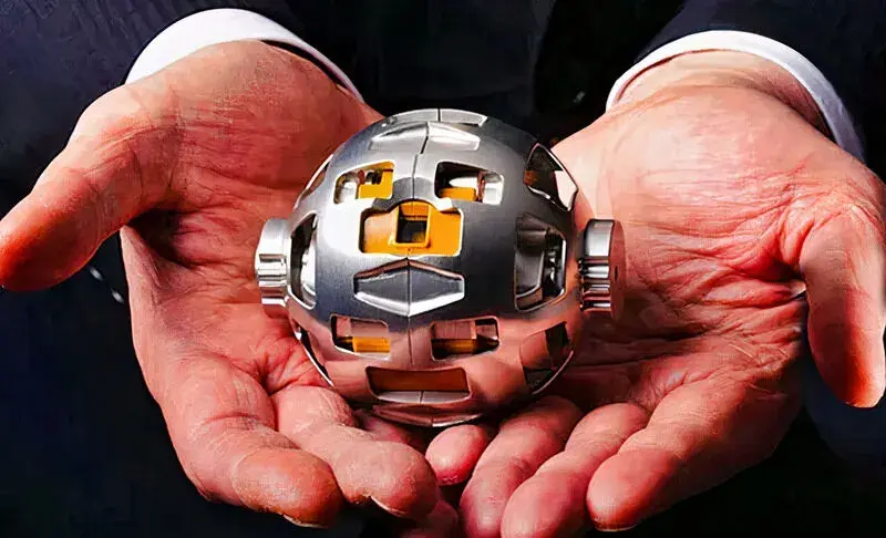

TIL that Takara Tomy (the company that made the Transformers toys) designed the Transformable Lunar Robot LEV-2, aka Sora-Q (“sky sphere”):

It’s nice here, but a bit under-federated. Other @Deebsters are available.


TIL that Takara Tomy (the company that made the Transformers toys) designed the Transformable Lunar Robot LEV-2, aka Sora-Q (“sky sphere”):


Ah, ok, that makes more sense. That also solves any ordering problem if you, say, you’re running local and elsewhere commands and a sync means pressing up gives you an unexpected item.


Sync seems like it’s going to be more pain than its worth unless you have all your machines configured the same. I’m not even running the same distros between machines…
And kills it.


This is a great read, I’ll definitely bookmark this for when someone says it won’t be problem.
I’m a massive fan of skeuomorphic design, and Windows 98 was just so intuitive and practical. Things you could drag looked like you could move them, that bumpy texture thing was used in places it wasn’t obvious already, and 3D made clickable things look like buttons.
I’m a software developer and power user, and Android surprised me by having a horizontally scrollable area with absolutely no indication other than the visible items didn’t include something I was expecting to find.
Arguably, the fix should be to “it” since anon is a utility account, not a user.