excited to see what this means for the project, the poor UI/UX of libreoffice is easily its most glaring flaw imo
I mean I got used to LO’s default UI and make me hate ribbon ui that come with MS OF and Onlyoffice, so I hope they improve on the default ui instead of replacing it (if they replace it atleast keep the old ui as a toggle)
FYI: You can use the new Collabora Desktop Version of LibreOffice with a streamlined interface if you want.
https://www.collaboraonline.com/blog/collabora-online-now-available-on-desktop/
Hey I just used libre writer today. It was a smooth experience. Surprisingly easy ui.
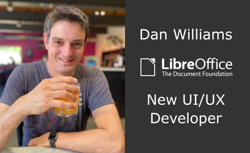
software engineer, team lead, and manager at Red Hat for more than 20 years.
Please keep this man away from ui/ux. Nerds designing UI is how libre office got in this mess in the first place.
Nerds are the reason computers even exist. Maybe you need to leave the internet You muscle-brained jock. Go take your protein-shake
Ok? They can stick to building computers and people who actually use the computers can work on their usabilities. Nerds dont need ui they can use the terminal.
‘Nerds should stick to building computers’ but not the software computers are running is honestly one of the more harebrained takes I’ve read.
He is not designing the UI, he will be implementing it.
The UI and UX will stay bad as it is, just on a modern technology stack.
Libreoffice is dope af.
Agreed, if you grew using another program, switching is hard unless it’s UX/UI is superb.
When I ditched Adobe, Inkscape was a breeze. GIMP is hard AF and Krita a bit easier but it doesn’t have the features I need. I ended up using Photopea, and now I’ve tried Affinity and it’s the best Photoshop alternative I’ve tried yet.
Collabora is looking pretty good so far. Still a few rough edges but easier than any other FOSS office software.
GIMP is well worth getting used to, especially now we are post 3.0 with a proper non-destructive workflow for filters/effects. I had always found it confusing to learn, having the Photoshop UI fossilised into my neural pathways, but what unlocked it for me was following an online GIMP course for 2/3 hours, which amounted to far less time than I had formerly spent cracking photoshop or working to pay for it.
Some great plugins are coming out now too. The Batcher plugin in particular makes GIMP (and GMIC by extension) extremely powerful for automation.
Good times.
Inkscape is my favourite Linux program. And the UI got so much better the last few years.
Inkscape was hell for me when I tried it years ago. I just had no clue where to find stuff and how to navigate properly. Maybe I have to give it another try.
Says more about you than Inkscape. Seriously. It’s build like literally almost every other program out there. Tools to the left, menus at the top, navigation and other windows at the right. How can you not find stuff?
This comment also says more about you than me. Not so seriously.
I’m quite serious. That’s why I wrote “seriously”. ;-)
I guess I hit a nerve, since you didn’t tell me how you can not find stuff…
They have a point.
I’m kind of the other way around:
I’m used to Inkscape since forever. I’m no graphics design expert, but do know my way around Inkscape for simple SVG editing, mostly stuff shamelessly taken off Wikimedia.
Way back in college, I enrolled in an elective “graphic design” course. Of course, being a course, they used Illustrator.
That thing works nothing like Inkscape. It was a long time ago, but I remember being baffled by it, to the point of being unable of doing basic stuff.
To be fair, I had no need for learning Illustrator and no wish to do it either, so I quit the course while I still could and exchanged it. I just felt like i’d be losing my nerves on switching, when I had better stuff to do than becoming dependant on Adobe and losing my minf in the process.
Both programs may indeed sport menus in the same spots, but the menus aren’t the same. They may look like the same thing, but they’re really not.
It’s kind of like a bus and a train. Illustrator (the bus) sports all the nice stuff (i assume) from other Adobe stuff. Just like a bus uses the same road like cars do, with the same signalization.
Inkscape is more like the train. It does things differently from say Krita or Gimp, but it also does other stuff than either Krita or Gimp. Which (dare I say) makes it more effective at what it’s meant to do.
Nothing like illustrator? Seriously? They have tools named the same, doing the same thing. Maybe some shortcuts are different, but if you really are that set in your ways, you can go change it in Inkscape. You can even go into the settings (named settings, under edit, like in almost every other app) and set the shortcuts to Adobe Illustrator (or a number of other apps), and then you have the same shortcuts in Inkscape.
Please be concrete here. Tell me exactly a menu item that does something fundamentally different in Inkscape, than it does in Illustrator?
Do you really need the exact same menus with the exact same options in each app? If so, then you are basically saying that you want the same program, and then this talk is rather pointless…
You do know the difference from vector graphics and bitmap, right?
I think it’s ok for switching to be hard if the UI is built for productivity. I’m not really a “creative” worker in the most common sense, so I’m guessing GIMP’s UI sucks even after you learn it, but I do know VIM is not intuitive at all, yet improves productivity compared to most IDEs/text editors. I’ve also worked on an application, working closely with our somewhat technical users, and they would suggest UI changes that were often not intuitive, but increase their productivity a bit (less need for using a mouse, less keystrokes/clicks and stuff like that).
YMMV but I’ve found the GIMP UI to be pretty much on a par with photoshop after having learnt the UI and learnt/modified the keyboard shortcuts. Some things are in fact better in GIMP, like panning and zooming. I’ve transitioned to GIMP on my own hardware but still use photoshop at a workplace.
If photoshop was open source then I think there would be a conversation to be had but I wouldn’t pay for it now that I’m used to GIMP.
I love Inkscape, it’s so intuitive! I didn’t even need to read the docs. And now that Affinity is coming to Linux I’m hoping I can switch my work to these options.
now that Affinity is coming to Linux
Wait, what?
Edit: I’ve only found this and if this site were to be trusted, I would take it with a grain of salt. https://techcentral.co.za/affinity-for-linux-canvas-next-big-move-could-reshape-the-desktop-software-market/274861/
Why do people keep saying “UI/UX”?
UI is user interface.
UX is user experience.
One is to be developed (with code), and the other is to be designed (in Figma for instance). They have very little overlap!
You design the UI while considering the UX. You only develop the UI, but you need to Design the UX and then design the UI considering UX before developing it.
Both are to be designed then developed.
Boo. It’s one of the last GUI software without user infantilization syndrome. Go use Google Docs if you want your software to coddle you.
I swear if LibreOffice starts talking to me like I’m a child like MS Office does or starts having animations that actively slow me down and spike my CPU usage just to open a menu or something.
Also, I’ve noticed a pretty strong correlation between “modern UX” and instability in office software. I don’t think I’ve ever had LibreOffice crash on me, the last major UX revision of MS Office definitely crashed more often than LibreOffice, and the latest version of MS Office crashes at least once every time I have to use it taking my unsaved work with it even with autosave on. I don’t know what “experience” they’re aiming for but not crashing and causing data loss should probably be prioritized over making it look pretty.
I understand that real men like you want their software to hit them in the face on start-up, and then refuse to do anything until you type SUDO, but LibreOffice UI isn’t even “good” kind of difficult. It’s not like Vim, where once you learn how to use it you become much more productive. LibreOffice is just a plain old mess. You start by selecting one of four UIs, where you need to guess which one actually works (I remember that a basic feature that I needed, after the extensive search, turned out to be unavailable in the UI that I selected at the start).
Yeah lol I tried the Tabbed UI and then went back after it was unusable
Maybe the “you never get a second chance for a first impression” is indeed unfair but it is hurdle for adoption.
In my case my motivation to keep using and trying LibreOffice is driven by the hate for MS and not by the love for LO.
For example: I went through some eye surgeries and really needed a dark mode. But I couldnt get a dark mode in which buttons still were cleary visible. Icons not showing well and hard to tell what they were for. Meaning I kept hoping the tooltips showed something usefull. But “reading” icons is a bit strange … I am sure if I search forums, git issues and documentation something usefull will turn up.
And maybe its infantile like you said but I sure like contextual filled menubars since PaintshopPro in 2005. So whats with the empty menus showing a handfull buttons and everything else in some cornermenu? Seems like a waste of screen real estate.
As for dataloss: sure my data wasnt lost but loading and pivoting a 90k row data table made Calc freeze and only restarted after killing it. 90k is not for everyone but it sure isnt a lot either in spreadsheet land.
I went through some eye surgeries and really needed a dark mode. But I couldnt get a dark mode in which buttons still were cleary visible.
I am sure if I search forums, git issues and documentation something usefull will turn up.Ask and ye shall receive: https://ask.libreoffice.org/t/issues-with-libreoffice-icons-on-dark-mode-in-linux-mint-22-cinnamon/111034
This is great, thank you! I had not gotten around to actually attempting to troubleshoot this, but was just accepting that I should just know where the buttons are for now.
They can develop multiple UI’s. One for normal users and a classic one for people who like everything without a single menu bar or drop down menu to abstract the clutter away
They already have four. What they need is one which supports 100% of the features, is easy to use and selected by default. They might keep other more advanced UIs but forcing new users to select UI as a first step, before they can do anything in the software is just plain stupid.